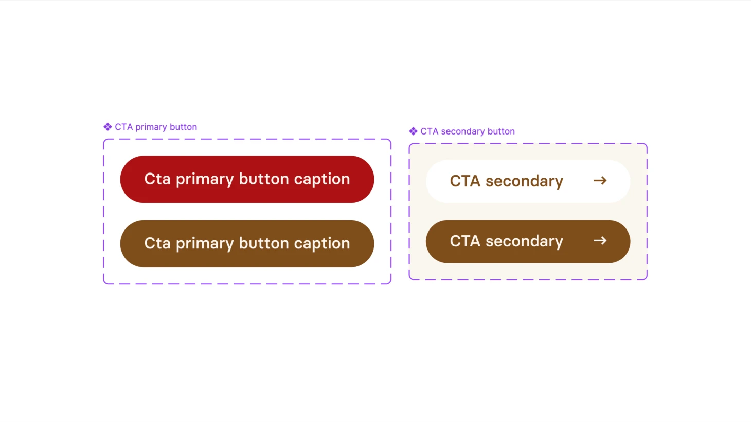
CSS styl pro primární a sekundární buttony
Zobrazit
/CTA primary button/
.cta-primary-button {
display: inline-flex;
height: 44px;
max-width: 264px;
padding: 11px 22px 13px 22px;
justify-content: center;
align-items: center;
gap: 22px;
flex: 1 0 0;
color: #FAF6EF;
text-align: center;
leading-trim: both;
text-edge: cap;
font-family: „Basier Circle“;
font-size: 15px;
font-style: normal;
font-weight: 500;
line-height: 22px;
border-radius: 22px;
background: #AC1114;
}
.cta-primary-button:hover {
background: #7F4D1B;
}
/CTA secondary button/
.cta-secondary-button {
display: inline-flex;
height: 40px;
max-width: 264px;
padding: 11px 18px 13px 22px;
align-items: center;
gap: 24px;
border-radius: 20px;
background: #FFFFFF;
flex: 1 0 0;
color: #7F4D1B;
text-align: center;
leading-trim: both;
text-edge: cap;
font-family: „Basier Circle“;
font-size: 15px;
font-style: normal;
font-weight: 500;
line-height: 20px;
}
.cta-secondary-button:hover {
background: #7F4D1B;
color: #FAF6EF;